Mapping Urban Heat by Census Tract in R
February 13, 2021
Another one from the archives–this is one of my projects from my time at the Guinn Center, and something I very much wish I could have developed further: an analysis of urban heat in Las Vegas.
Background
For the past several months, I have been working on an analysis on the effects of urban heat on vulnerable populations, particularly during a public health crisis. For some background, I currently live in Las Vegas, where summer heat can exceed 110 degrees. Last summer included a 45-day-long streak of temperatures over 100 degrees.
Urban heat is not distributed evenly within cities. Features such as parks or ponds can lead to cooler temperatures in some areas, while areas without foliage or with dark surfaces such as roads and buildings lead to warmer temperatures. This effect is particularly pronounced at night: urban surfaces absorb heat during the daytime, warming the air at night.
An NPR Special Series titled Heat and Health in American Cities compared urban heat to household income in the 100 most populated cities. They found that, in many cities, income and urban heat were inversely related: lower-income households tended to be in the parts of cities most affected by urban heat, while higher-income households were more often found in cooler areas.
The key to this research was aggregating urban heat data within census
boundaries (such as tracts or blocks). I decided to recreate this analysis in
R. Once urban heat data is linked to Census-designated boundaries, it can easily
be compared to metrics such as income, poverty, disability, access to health
insurance, demographics, any many other data points collected by the U.S. Census
Bureau's American Community Survey (ACS). In R, obtaining and mapping these
metrics is a relatively simple process with packages such as tidycensus and
tigris.
The remainder of this post will provide a very brief overview of how to obtain satellite surface temperature data; aggregate those data points within census tracts; and plot the results. I don't know if this mapping exercise will make it into the final project report, but I learned a lot from working through it, and I wanted to make sure to document my steps here.
Though it should be possible to follow this guide without much prior experience working with spatial data, This free book, Geocomputation with R by Robin Lovelace, Jakub Nowosad, Jannes Muenchow, is an excellent resource for those interested in learning more. It is particularly useful for understanding topics such as projections and the differences between raster and vector data. The section on Raster-vector interactions is particularly relevant to this task as we will be taking raster values (the heat map) and aggregating them within polygon boundaries (census tracts).
Getting the Data
I obtained surface temperature satellite data from the NASA/USGS Landsat 8 satellite. The data can be obtained through an API, though for this example, I downloaded the data manually. I looked for data meeting the following criteria:
- From June-August 2020
- Cloud cover less than 4%
- Landsat C1 Analysis-Ready Data (ARD) datasets
- I ultimately downloaded a raster map with ID
LC08_CU_005011_20200806_20200824_C01_V01. This map came from 06 August, 2020. Details, including a download link, can be found here.
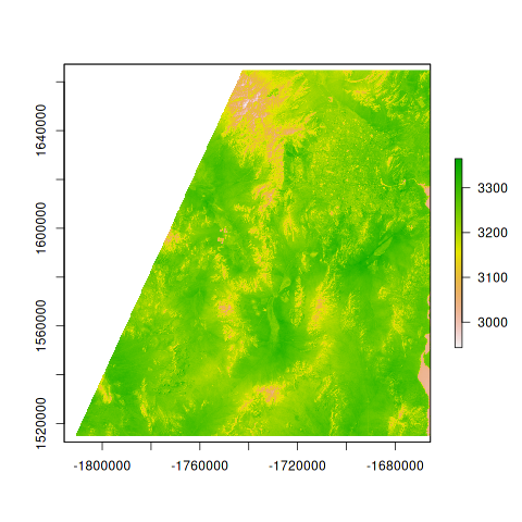
So what data did we actually obtain? Downloading the "Provisional Land Surface
Temperature" file returns a .tar file with a number of .tif raster images. We're
interested in the one with ST.tif at the end (ST for Surface Temperature). This
provides a raster map of the region, at 30-meter spatial resolution, with
surface temperatures in tenths of a degree Kelvin. That is, each 30-meter "cell"
in the map is associated with a surface temperature value.
Unpacking and Visualizing the Raw Data
This section requires the raster and sf packages. Below, we untar the map and
extract the map of interest.
library(raster)
library(sf)

## untar the data
untar(tarfile = "PATH-TO-TARFILE.tar", exdir = "DESTINATION-DIRECTORY")
file.copy("./data/raw/testsat/LC08_CU_005011_20200806_20200824_C01_V01_ST.tif",
          "IMAGE-DESTINATION/st_map.tif")

## Access the file as a raster image, plot, and save as png
st_map = raster("./data/processed/st_map.tif")
png(file = "./figs/st_map.png")
plot(st_map)
dev.off()
Starting from this map, we want to (1) crop to the area immediately surrounding Las Vegas, and (2) average the temperature values within each census tract, allowing us to compare tract-level surface temperatures to other data collected at the census tract level.
Mapping Heat by Census Tract
First, we'll use the tigris package to download the census tract boundaries in
Nevada and crop to the Las Vegas area.
lv_tracts <- tigris::tracts(state="NV") %>%
  st_crop(xmin=-115.38, ymin=35.92, xmax = -114.88, ymax = 36.38)
Next, we'll reproject our tract-level data such that it has the same projection
as the raster data. Computationally, transforming vector data (our tract data)
is much less expensive than transforming raster data. After reprojecting, we can
use the crop function from the raster package to crop the raster image to the
Las Vegas area as defined in lv_tracts.
lv_tracts_reprojected = st_transform(lv_racts, crs(st_map))
sat_cropped = crop(st_map, lv_tracts_reprojected)
With this accomplished, we use the raster::extract() function to extract the
mean of the raster values within the boundaries defined by
lv_tracts_reprojected, which contains the census tract boundaries projected to
align with the raster map.
heat_map = extract(sat_cropped,           # cropped raster object
                   lv_tracts_reprojected, # vector map of LV
                   df=TRUE,               # return as data frame
                   fun=mean,              # return the mean of each polygon
                   sp=TRUE)               # append to lv_tracts_reprojected

## Visualize
sf_heat_map = st_as_sf(heat_map)          # Convert to simple features (sf) vector data
png(file="IMAGE_DESTINATION/heatmaptest.png")
plot(out["st_map"])                       # plot the column of raster values
dev.off()
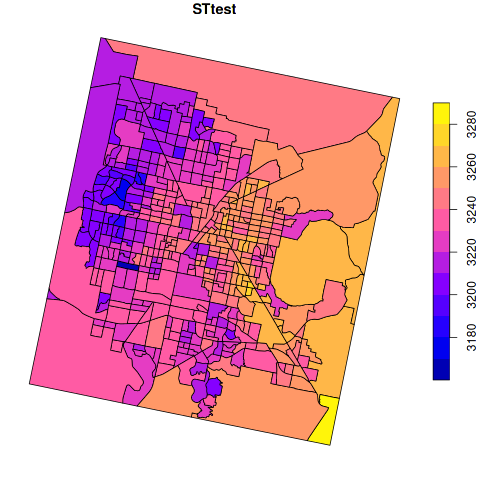
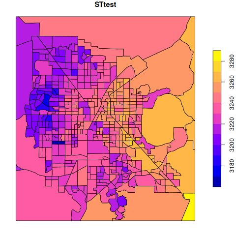
We're closer to our goal, but not quite there yet. Our map is rotated, and the scale (tenths of a degree Kelvin) isn't especially interpretable. First, we'll reproject the map to the correct orientation (back to the original projection of the census tract data).
heat_tracts_transformed = st_transform(x=sf_heat_map, crs = crs(lv_tracts))
png("tract_repro.png")
plot(heat_tracts_transformed["st_map"])
dev.off()
Final Maps
Lastly, we can apply some formatting to make it more interpretable. I used
ggplot2 for all of the visual tweaks (details not shown).
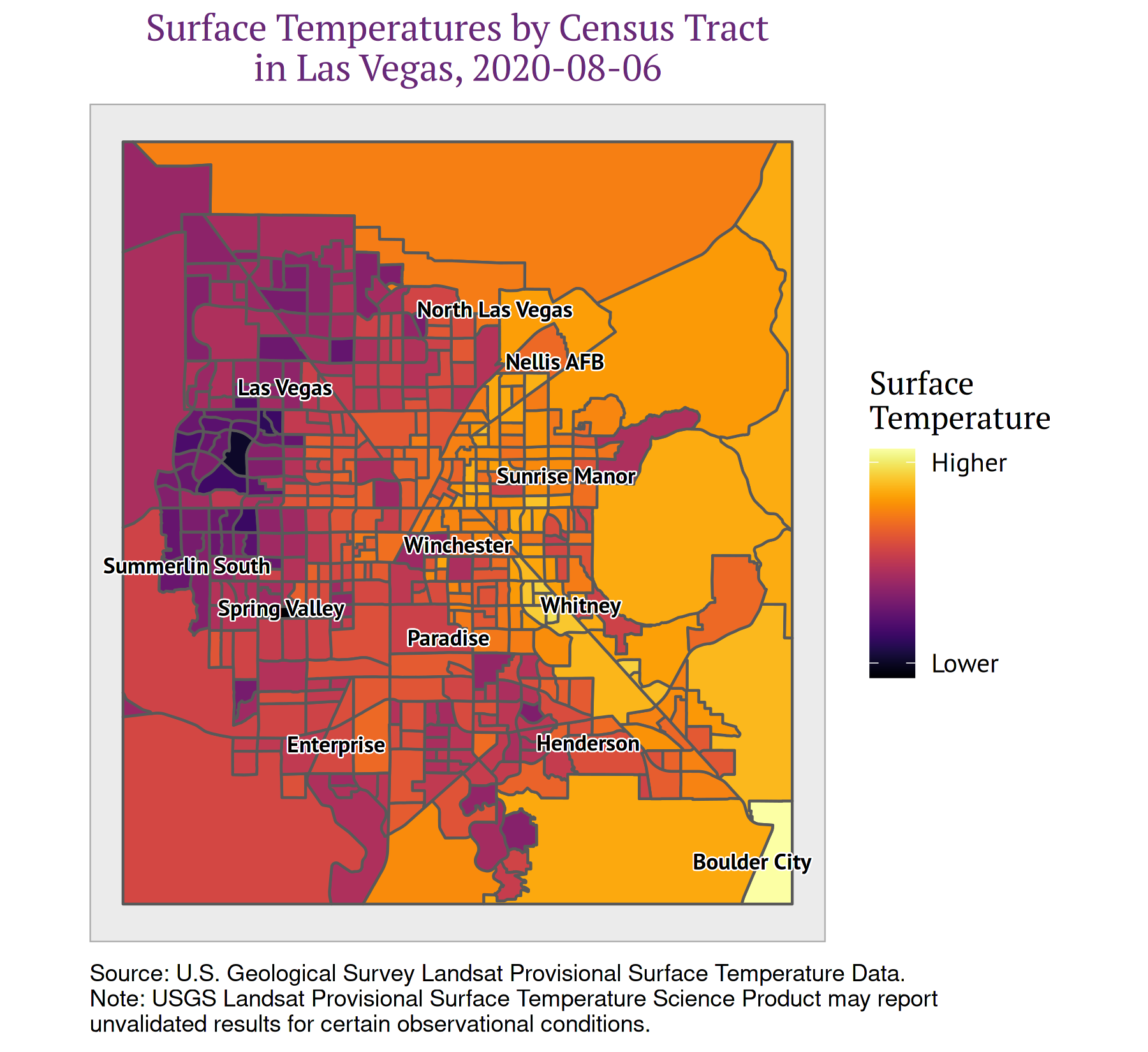
We can now plot other metrics by census tract and visually compare them to our urban heat map. For example, we can look at poverty by census tract:
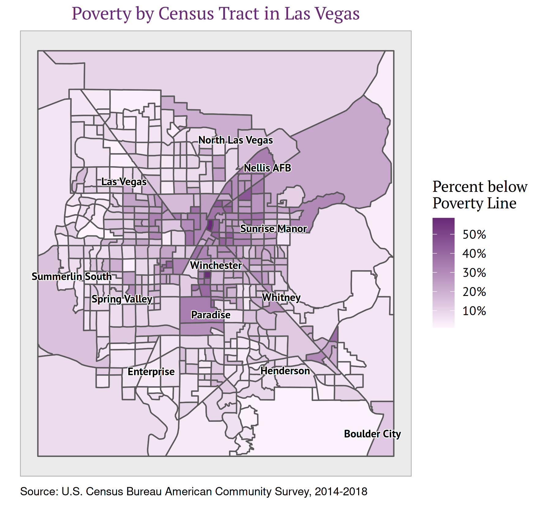
A quick visual inspection of these two maps shows that the Sunrise Manor and Winchester areas have relatively high temperatures and a high proportion of residents living abelow the poverty line. Conversely, the Summerlin area on the west side of Las Vegas has among the lowest temperatures and the lowest rates of poverty.
There are plenty of additional analyses we can conduct from here. The NPR report linked above calculated correlations between tract-level surface temperatures and household incomes to determine that the two were inversely correlated. There are also a variety of spatial regression models and statistical learning/machine learning techniques that can be applied to spatial data. Understanding how to connect different sources of spatial data – such as the census tracts and heat data above – is an important first step to conducting these analyses.
Resources
- CRAN Task View: Analysis
of Spatial Data: A CRAN hub explaining the
Recosystem of spatial data analysis packages - Spatial Data Science with R: A site providing a broad overview of spatial data
science concepts and methods in
R. - Geocomputation with R: A book by Robin Lovelace, Jakub Nowosad, and Jannes Muenchow, now published by CRC press. I learned most of what I presented above from this book, which provides a thorough account of the ways of manipulating, mapping, and analyzing spatial data, with numerous excellent examples.