Basic Plotting in Julia
In this short post, I show one of the many ways of using Julia within emacs org mode, and will describe some of the basic plotting functionality in Julia.
Getting Started with Julia in Org Mode: jupyter-julia.
While julia-snail is my favorite Julia development environment, it's support for
org-mode is, at present, quite limited. For example, it seems to ignore the
:file argument, making it difficult to save figures to specific locations. I
find that emacs-jupyter provides the most featureful and reliable way to work
with Julia in org-mode. Read the emacs-jupyter documentation for instructions on
how to use emacs-jupyter with org-mode.
Making some Plots
Let's make some plots. We'll use the Plots.jl package and explore a few
different plotting styles. First, we load the packages we'll be using. I tend to
plot statistical distributions fairly often, so I'll load Distributions and
Statplots in addition to Plots.
using Plots
using Distributions
using StatsPlots
Building Plots Incrementally
With these packages loaded, we'll start simply and plot a standard normal distribution.
plot(Normal(), fill=(0,0.5,:red))

The Plots.jl package makes it easy to update plots after creation. A Julia
convention is that methods ending in ! modify their arguments in place. In this
case, we can call plot!() to incrementally add to our plot.
plot!(title="Standard Normal Distribution", xlabel="x", ylabel="p(x)") # Add Labels
plot!(leg=false) # Remove the Legend

Let's make one final set of changes and update some of the font sizes for better readability.
plot!(tickfont=font(18, "courier"),
      guidefont=font(18),
      titlefont=
font(18, "Computer Modern"))

Plotting Real Data
That's enough of that. Usually we're plotting real data, not standard standard
distributions. Let's get some. First we'll pull from the RDatasets package,
which is an excellent source of go-to data science and statistics examples such
as mtcars and iris. We'll use the venerable mtcars to show how to work with data
in a basic way.
using RDatasets, DataFrames
mtcars = dataset("datasets", "mtcars")
mtcars[1:10,:]
10 rows × 12 columns (omitted printing of 3 columns)
| Model | MPG | Cyl | Disp | HP | DRat | WT | QSec | VS | |
|---|---|---|---|---|---|---|---|---|---|
| String31 | Float64 | Int64 | Float64 | Int64 | Float64 | Float64 | Float64 | Int64 | |
| 1 | Mazda RX4 | 21.0 | 6 | 160.0 | 110 | 3.9 | 2.62 | 16.46 | 0 |
| 2 | Mazda RX4 Wag | 21.0 | 6 | 160.0 | 110 | 3.9 | 2.875 | 17.02 | 0 |
| 3 | Datsun 710 | 22.8 | 4 | 108.0 | 93 | 3.85 | 2.32 | 18.61 | 1 |
| 4 | Hornet 4 Drive | 21.4 | 6 | 258.0 | 110 | 3.08 | 3.215 | 19.44 | 1 |
| 5 | Hornet Sportabout | 18.7 | 8 | 360.0 | 175 | 3.15 | 3.44 | 17.02 | 0 |
| 6 | Valiant | 18.1 | 6 | 225.0 | 105 | 2.76 | 3.46 | 20.22 | 1 |
| 7 | Duster 360 | 14.3 | 8 | 360.0 | 245 | 3.21 | 3.57 | 15.84 | 0 |
| 8 | Merc 240D | 24.4 | 4 | 146.7 | 62 | 3.69 | 3.19 | 20.0 | 1 |
| 9 | Merc 230 | 22.8 | 4 | 140.8 | 95 | 3.92 | 3.15 | 22.9 | 1 |
| 10 | Merc 280 | 19.2 | 6 | 167.6 | 123 | 3.92 | 3.44 | 18.3 | 1 |
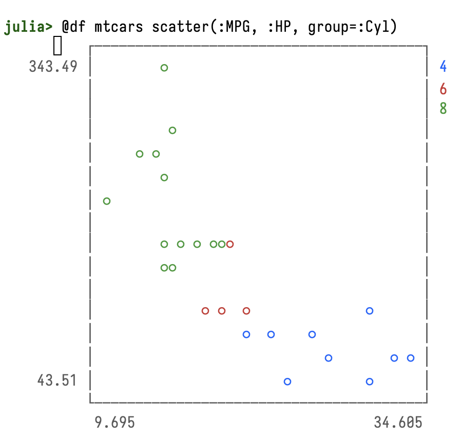
We can use the @df macro and access columns by prepending them with :.
gr()
@df mtcars scatter(:MPG, :HP, group=:Cyl, background=:black, msize=8, keytitle="N Cylinders")
xlabel!("Mpg")
ylabel!("HP")
title!("Horsepower by MPG and N Cylinders")

Modifying Plot Visual Components
It's not always straightforward to figure out how to modify visual components of a plot. Most of the relevant information lies in the Attributes section of the Plots.jl documentation (and its subsections).
Different Plot Styles
One of the benefits of the Plots.jl package is its support for many different plotting backends. The default is GR which, according to the documentation, is
The default backend. Very fast with lots of plot types. Still actively developed and improving daily.
and it offers speed; 2D and 3D plots, and standalone or inline plotting.
Here we'll repeat the plot above with the UnicodePlots backend. We first need to
install the package with add UnicodePlots in the package manager. Note that you
can do this right from the Jupyter repl in emacs-jupyter by pressing ] in the
repl.
We then specify that we'd like to use this backend with the unicodeplots() function.
unicodeplots()
# scatterplot
@df mtcars scatter(:MPG, :HP, title="HP vs MPG", xlabel="Mpg", ylabel="HP")
                        HP vs MPG
       +----------------------------------------+
343.49 |        ⚬                               | y1
       |                                        |
       |                                        |
       |         ⚬                              |
       |     ⚬ ⚬                                |
       |        ⚬                               |
       | ⚬                                      |
    HP |                                        |
       |        ⚬ ⚬ ⚬ ⚬⚬⚬                       |
       |        ⚬⚬                              |
       |                                        |
       |             ⚬ ⚬  ⚬              ⚬      |
       |                  ⚬  ⚬    ⚬             |
       |                            ⚬       ⚬ ⚬ |
 43.51 |                       ⚬         ⚬      |
       +----------------------------------------+
        9.695             Mpg             34.605
I haven't yet figured out how to get the colors to appear as they are supposed to in org mode, so for now, I'm simply showing a basic scatterplot with no grouping. I'll update if and when I figure that out. It should look like this:
Conculsion
There's a lot more to get into with plotting in Julia and with using Julia in emacs. This post serves as a small jumping-off point—just enough to get started, with a few pointers to further resources, and some questions to start pursuing. I'll write more on this topic as I learn more!